Designing Pinpoint


Designing lays a strong foundation for user experience, helping to define a project's needs and features.
This week, I jumped into Figma and started designing Pinpoint. I haven't chosen a colour scheme yet, so this design focuses solely on the UI for different app stages.
The Three Key UI Stages
In the design, I focused on Pinpoint's three main stages - adding the first goal, filling out the goal form, and adding another goal.
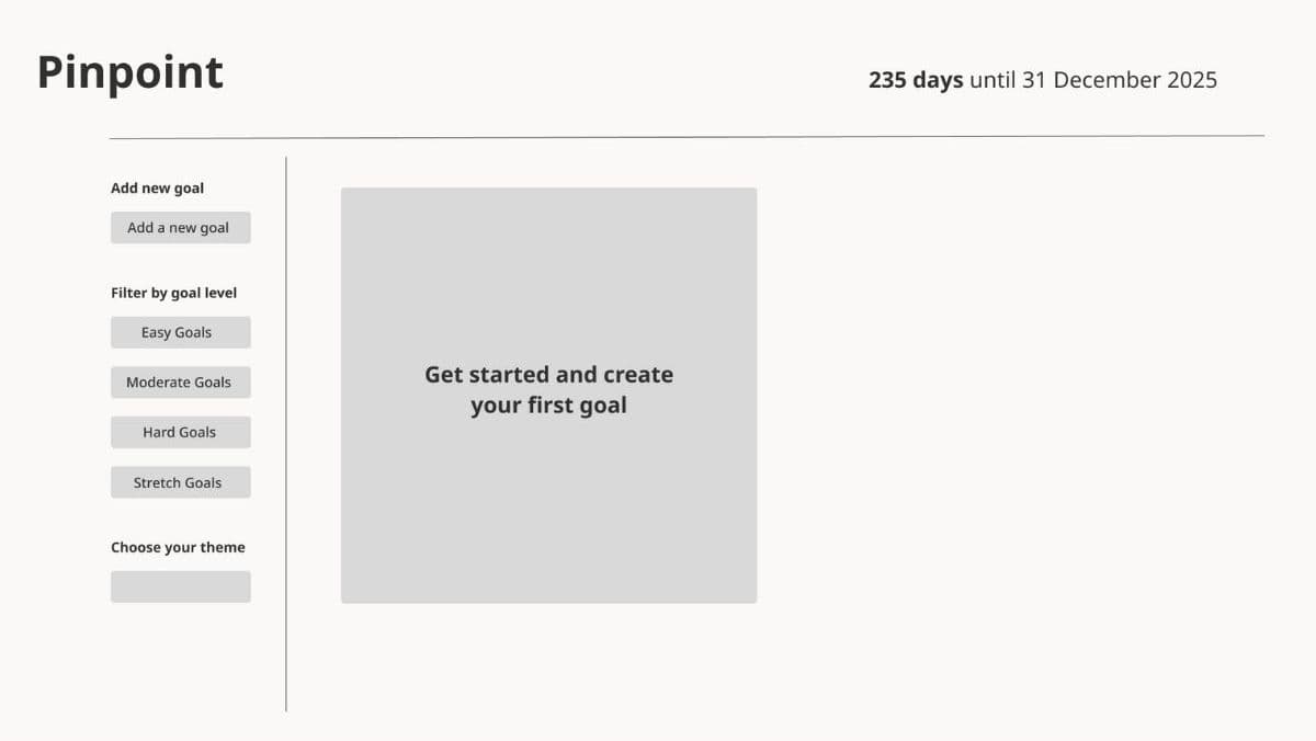
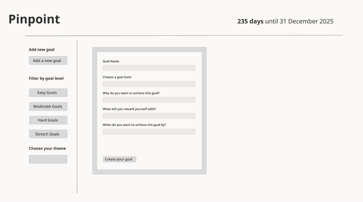
Pinpoint's starting screen features a greyed-out block prompting the user to 'Get started and create [their] first goal.' Clicking this block opens a form for creating their first goal.
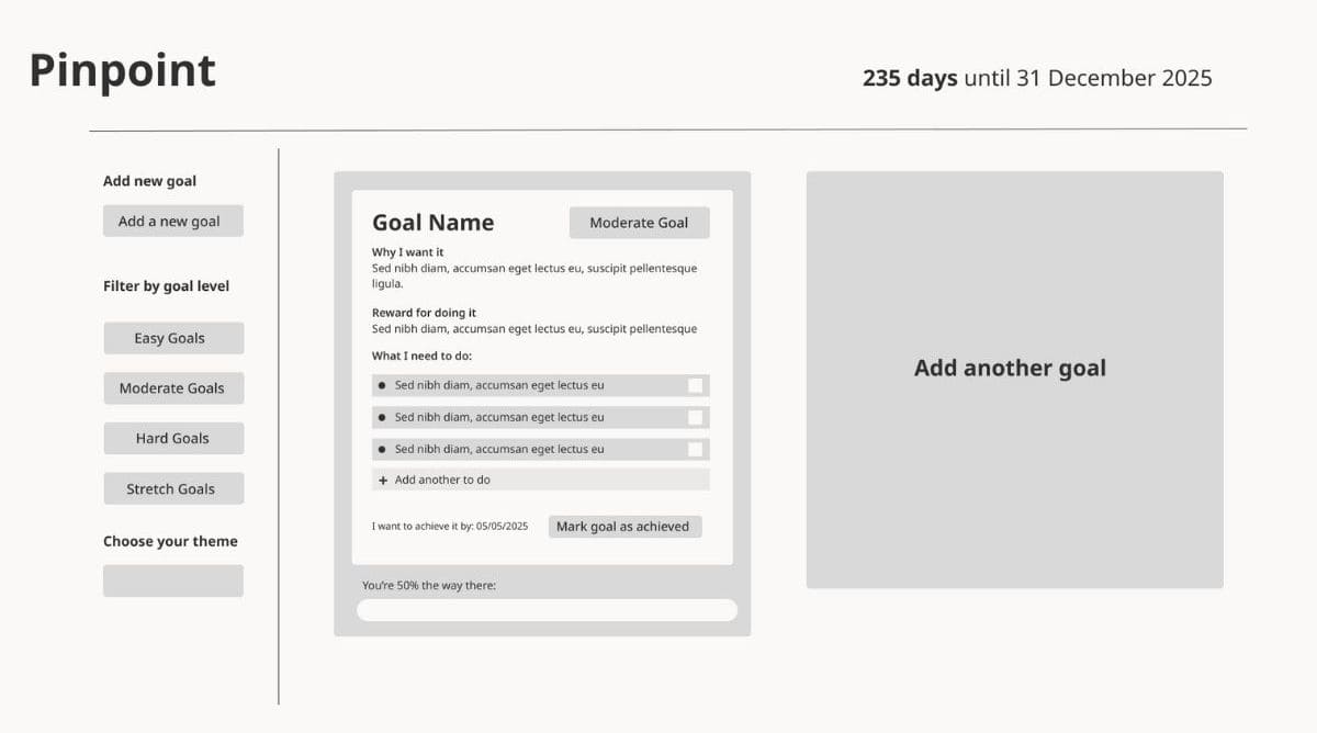
After filling out the form and clicking 'Create your goal,' the completed goal appears on screen, along with a second block prompting the user to 'Add another goal.' Just like in the first two stages of the app, clicking 'Add another goal' turns the block into a goal form, which, once completed, becomes a saved goal.
These three designs focus solely on the actions required for the next block to appear on screen. This will help me next week when implementing the functions and conditional logic for each stage.
In the coming weeks, I will focus on user interactions and UI changes within the saved goal block. Additionally, Pinpoint includes goal filtering and color customisation. I haven't focused on the UI design yet, but I plan to soon.
Final thoughts on this week
Overall, this week was a great exercise in thinking through how I'll code the functionality of my designs. I believe everything I've designed is manageable and not too ambitious for a team of one.
Next week, I'll begin developing the functionality for the three stages of Pinpoint - and maybe even finish them.